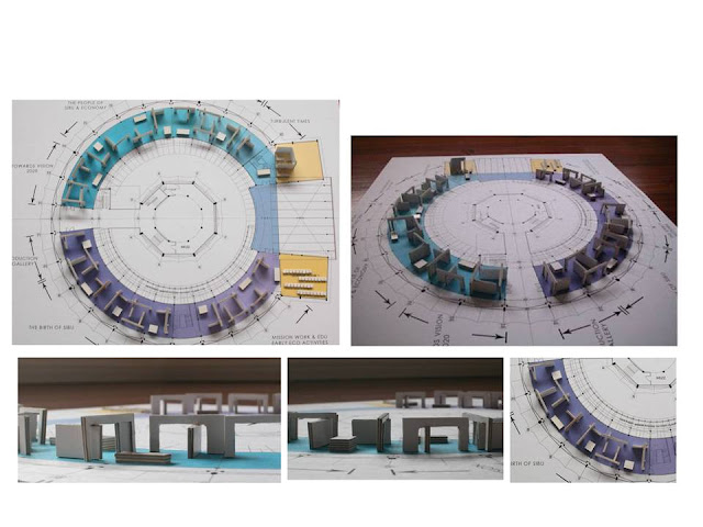
We had some difficulty starting the exhibition design, until someone remarked that the circular floor plan reminded her of a board game. This was especially apt as we are keen to conduct the movement of the museum visitors and sequence the display of the exhibits. We merged this idea with another which depicts the movement through Sibu's alleyways and lanes; ducking under canvas canopies and weaving in between street stalls and furniture.
The completed 'project' allowed the casual visitor to walk on the outside to gain cursory knowledge about the exhibition - reading the headlines so to speak. The interested parties such as these students would delve into 'alley-ways and lanes' to discover a more in-depth experience of Sibu's history.This project was completed in 2011


No comments:
Post a Comment